Abhijeet's Component Library
Now with support for dark-mode
This library was developed to be used with my portfolio, which would be published after this library is online.
This library was developed to be used with my portfolio, which would be published after this library is online.
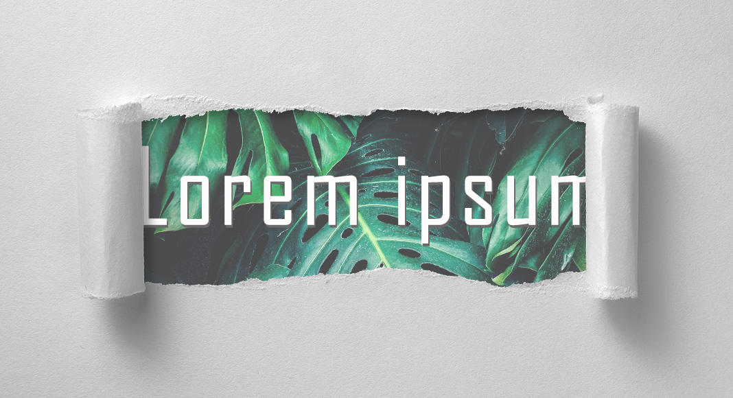
 Header
 Navigation
This is for navigating through the website. This usually is inline and in header of the page, in the following order:
 Typography
It's important to note that these tags have difference meaning so as to identify the significance of the text. This comes in handy for the accessibility tree as mentioned earlier.
This is small text, which is a smaller font size and they all (small, 'em', 'cite') are inline elements, there syntax is stated in the next topic in form of lists. Aside text
 Lists
ListsThere are two types of lists, ordered lists and unordered lists. The ordered lists have a numbering before them indicated a order of items listed. These lists can be represented in either in block or inline form.
This is a ordered list in which numbering start from 1 and goes in order.
<small> Lorem Ipsum </small><em> Lorem Ipsum </em><cite> Lorem Ipsum </cite><small> Lorem Ipsum </small><em> Lorem Ipsum </em><cite> Lorem Ipsum <cite>This is a ordered list in which the numbering starts from the last upto 1 in reverse order.
<small> Lorem Ipsum </small><small> Lorem Ipsum </small><cite> Lorem Ipsum <cite><small> Lorem Ipsum </small><small> Lorem Ipsum </small><cite> Lorem Ipsum <cite>This is an unordered list represented by bullets.
<small> Lorem Ipsum </small><em> Lorem Ipsum </em><cite> Lorem Ipsum </cite><small> Lorem Ipsum </small><em> Lorem Ipsum </em><cite> Lorem Ipsum </cite> Links
LinksThe links here are not pointing to anything as of now, but the syntax for the same would be provided, For example:
This is a link, not a buttonThe syntax for the above would be:
<a href = "path">This is a link.</a>
 Button
The buttons are not doing anything as of now.
The syntax for the above would be:
<button type="button" >This is a button</button>
The output would be:
 Code
CodeThe <code> tag creates a block for representing a computer code. It will be in the default monospace style of the user agent, but it can be embeded with other hosting services like github, below is an example.
But sometimes a custom design is preferred to set it according to theme of the webpage, for example, the same code but with the styling mentioned in above code block.
                .code-base {
                    background-color: var(--toast-bg);
                    color: var(--light-yellow);
                }
 Containers
The following represent containers where different elements can grouped and can be placed according to the design.
There are two types of containers:
 Sections
There are different kinds of sections, they can either be normal section with a white background, with a off-white background and with a padding top and bottom.
In a section, due to default document object model (DOM), the heading size is smaller than when it is outside the section, so for a heading 1 - it's font size is 1.5 and not the default 2.This section will have a white background.
This section has a off-white background.
This section is a toast section.
This section is a toast section with a sound, which I will add later.
These cards can be used to represent anything in a card form, since being a grid layout, it will adapt according to screen size.
Mar 27, 2022
Windows 10 comes with a lot of bundled bloatware, which hogs down system resources. In this guide we remove bloatware from the windows ISO.
5 minutes
Mar 25, 2022
An abstract about flashing custom ROM to a android smartphone for beginners.
10 minutes
Mar 24, 2022
Wondering why you have FPS drops in linux, even though everything works fine in windows!?
3 minutes
More
A footer is the one at the bottom of the webpage. It mostly contains the header for footer (some text) and the social links.